Theme Customisation
Last updated
Last updated
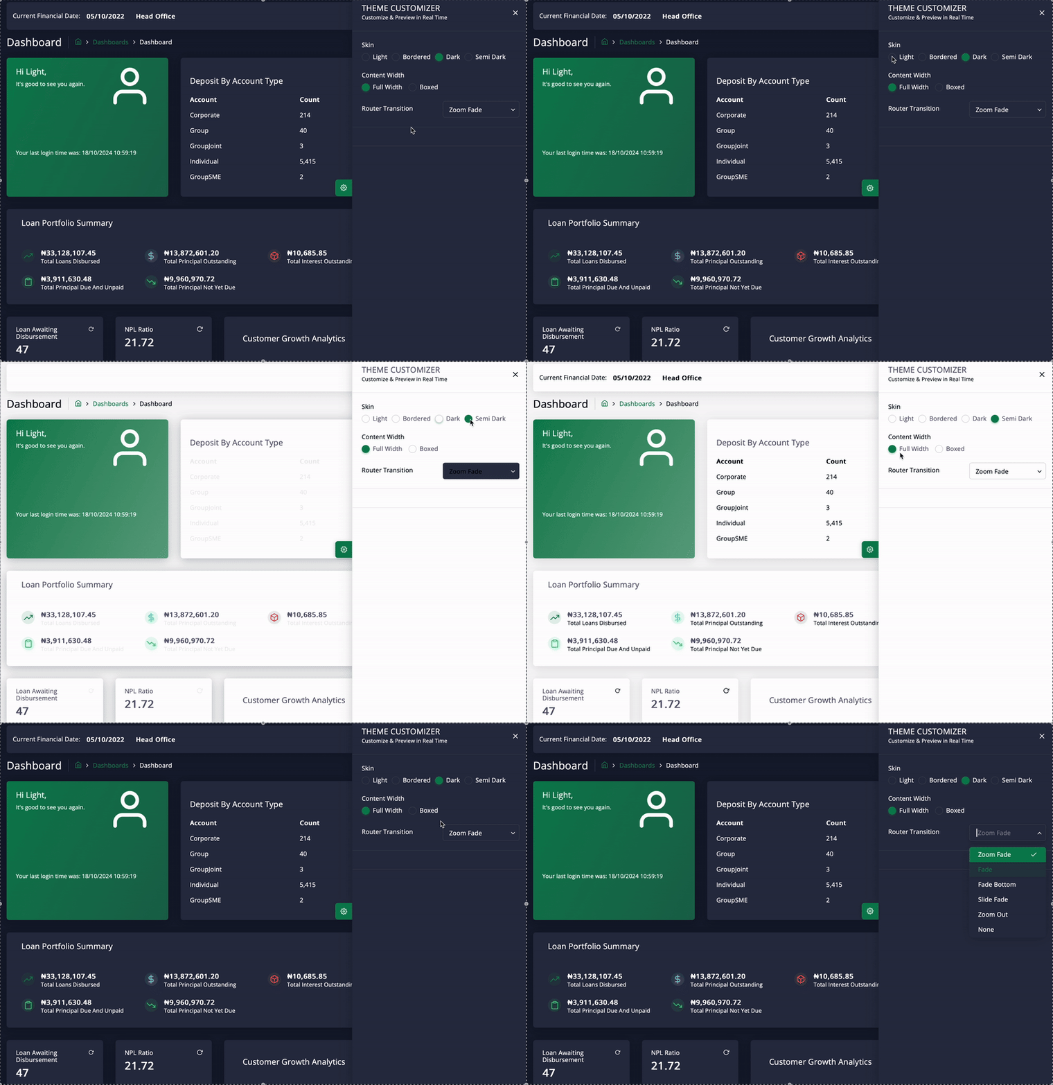
The Theme Customiser feature lets you personalise and adjust the application's visual appearance in real-time. Here’s a breakdown of the elements included in the Theme Customiser:
The Skin options for theme customisation provide various aesthetic choices for users. These options enhance both personalisation and usability:
Light: The "Light" option offers a bright colour scheme with a clean interface.
Dark: The "Dark" setting is ideal for low-light environments, reducing eye strain.
Bordered: The "Bordered" option adds distinct borders for better organisation.
Semi Dark: The "Semi Dark" theme offers a versatile balance between light and dark, adapting to different lighting conditions.
The content width options allow you to control how the content is displayed.
Full Width: The content stretches to fill the entire width of the screen.
Boxed: The content is limited to a fixed width, creating margins on either side of the application.
This option allows users to select the transition effects when navigating between different sections of the application. The following transition effects are available::
Zoom Fade
The page fades and zooms as it transitions.
Fade
A simple fade transition between pages.
Fade Bottom
The page fades in from the bottom.
Slide Fade
Pages slide with a fading effect during the transition.
Zoom Out
The current page zooms out as the next page loads (currently selected in the screenshot).
None
No transition effect is applied.